You've probably guessed the meaning behind fil-A, but do you know the secret significance of the A?

Here’s What the “A” in Chick-fil-A Stands For

Published on Feb. 04, 2025
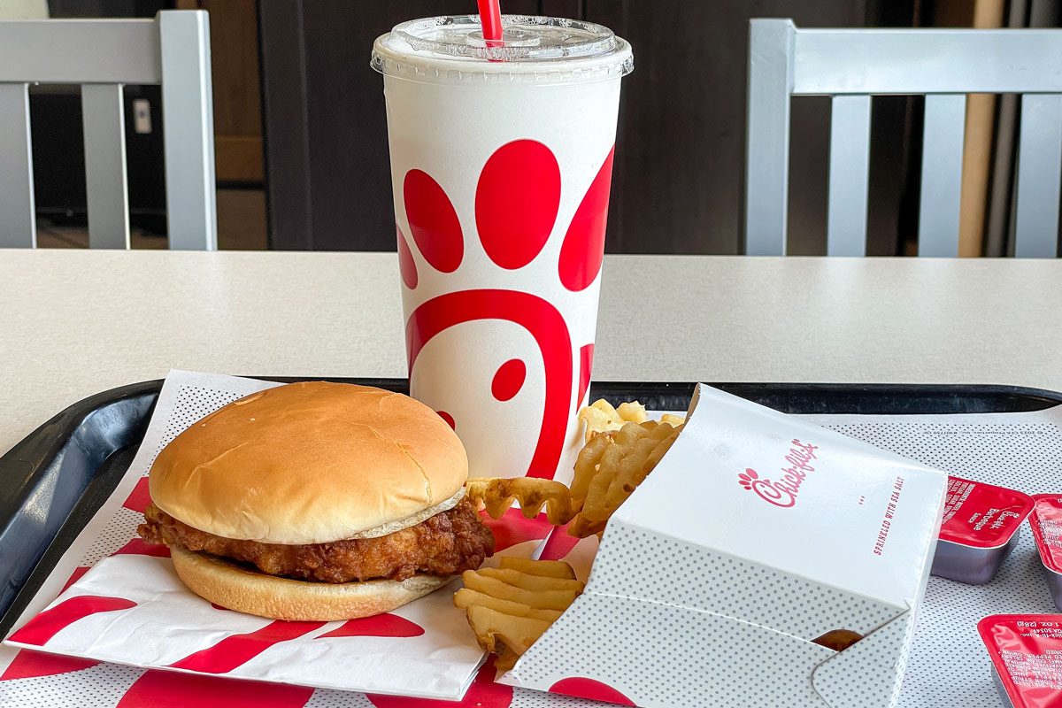
Between the signature sauces (which are truly the GOAT) and the juicy chicken sandwiches, it’s no surprise that Chick-fil-A was voted America’s favorite fast-food restaurant five years in a row. But its name is a bit of a head-scratcher.
Did the founder have a thing for hyphens? And what’s with the capital A to finish it all off? These are the things we ponder while waiting in Chick-fil-A’s busy drive-thru. So let’s investigate.
Get Reader’s Digest’s Read Up newsletter for more food facts, humor, travel, tech and entertainment all week long.
How did Chick-fil-A get its name?
The company’s founder, S. Truett Cathy, wanted the name to reflect his signature menu item: the Chick-fil-A Chicken Sandwich. The chick is pretty obvious—we’re talking about chicken, after all. It’s not just the most important ingredient in the famous sandwich, though. It’s the primary source of protein available from the fast-food chain.
Fil-A is a play on the word fillet, a boneless cut of meat or fish. (Not to be confused with filet mignon, an expensive cut of beef spelled with only one l.)
Sure, the wordplay is easy to understand. But why on earth is fil lowercased? Chalk it up to clever branding.
“In the case of Chick-fil-A and many other brands, odd spelling or offbeat imagery becomes a powerful tool in creating brand distinctiveness,” says Jackie Sumsky, a public relations consultant who’s worked with brands like Dunkin’ and Burger King. “These subtle or prominent mental cues become core assets that build collective memory and create emotional connection around a brand. A recent study by Ipsos and Jones Knowles Ritchie found that it’s not necessarily the brand’s design choices that are important but rather the sustained use of them over time.”
What does the A in Chick-fil-A really stand for?
The capital A works with fil to form a fillet sound-alike, but that’s not all. There’s a greater meaning behind the letter and the decision to capitalize it.
Turns out, the A stands for the Grade A chicken used in Chick-fil-A menu items. It’s a subtle way for the fast-food chain to make customers think of the U.S. Department of Agriculture’s food grading scale, which labels top-quality food Grade A.
What are some of the other theories behind the A?
The fast-food chain may have designed the final letter of its name as a nod to Grade A chicken, but the meaning has since expanded. As Chick-fil-A notes on its site, the capital A stands for “above-and-beyond” service. It’s also a reminder that workers bring their A-game every day.
How has the name changed over the years?
The restaurant’s name has never changed, but the Chick-fil-A logo got a tiny makeover half a century ago. See, before he opened the fast-food joint you know and love, Cathy founded the Dwarf Grill in Atlanta. On its menu: a Chick-fill-a sandwich. The sandwich logo featured an illustrated chicken, black cursive typeface, two ls and a lowercase a.
When he opened the first-ever Chick-fil-A in 1967, Cathy ditched one of the ls and capitalized the a, really putting an emphasis on food quality.
Some Chick-fil-A fans swear up and down that the logo featured a lowercase a as late as the early 2000s, but that is likely due to the Mandela effect, a collective misremembering of history.
“Chick-fil-A introduced its logo back in the ’60s, when fast food was largely associated with low quality,” says Milvydas Mažonas, creative studio director at marketing company Omnisend. “However, the brand set itself apart with their standard of excellence: A-grade chick, if you will. The reason their logo—a stylized chicken with a clean, even modern design—works is because it makes a connection between the brand’s product and its values: a commitment to high-quality food. So as the brand grew, their key selling point became their symbol, easily recognizable across various platforms and media. Why change it?”
And let’s be real: Most Americans aren’t thinking about the intricacies of logo design. They’re trying to settle the Chick-fil-A Deluxe vs. Spicy Chicken Sandwich debate before the fast-food attendant asks, “Can I take your order?”
About the experts
|
Why trust us
At Reader’s Digest, we’re committed to producing high-quality content by writers with expertise and experience in their field in consultation with relevant, qualified experts. We rely on reputable primary sources, including government and professional organizations and academic institutions as well as our writers’ personal experiences where appropriate. We verify all facts and data, back them with credible sourcing and revisit them over time to ensure they remain accurate and up to date. Read more about our team, our contributors and our editorial policies.
Sources:
- Jackie Sumsky, public relations consultant; interview, January 2025
- Milvydas Mažonas, creative studio director at Omnisend; interview, January 2025
- Chick-fil-A: “Where does the ‘A’ in Chick-fil-A come from?”
- Chick-fil-A: “How did Chick-fil-A get its start?”
- Logos-World: “Chick-fil-A Logo”